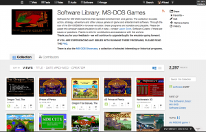
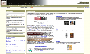
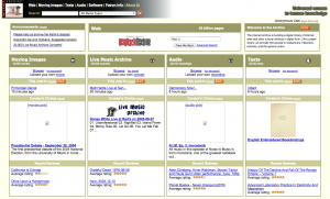
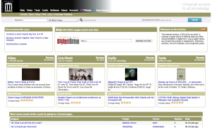
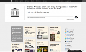
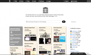
The new version of the archive.org site has been evolving over the past 6 months in response to the feedback we’ve received from thousands of our awesome users.
If you haven’t been following along, you can review a little bit of the journey through these blog posts:
- Building Libraries Together: New Tools for a New Direction (10/28/14)
- Redesigning Archive.org (11/5/2014)
- What’s New with V2 (2/12/2015)
Why change the site at all? The posts above help answer that, but in brief:
- 35% of our ~3 million daily users are on mobile/tablet devices, and the classic site is not easy to use on small formats.
- The new tools we want to offer our users would be difficult to implement in the old site architecture.
- The classic site was built a long time ago, using methods that are outdated. Finding programmers who have the skills to work in that environment is becoming increasingly difficult, and the ramp up time for new employees is painful. The redesign has given us an opportunity to start pulling the front end (what you see) apart from the back end, so they can evolve separately.
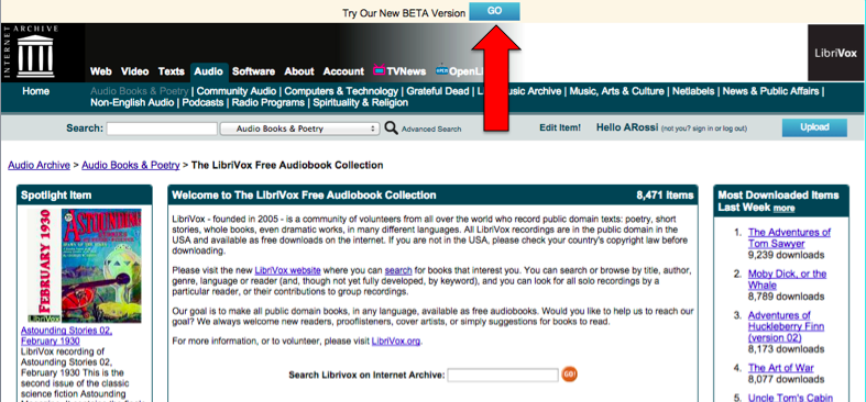
Currently about 85% of archive.org users are in the new version. Over the next few weeks we will be asking the remaining 15% to try it out. For the time being, users will be able to exit ![]() the new archive.org and return to the “classic” version — but the classic will not always be available or supported, so please give the new version a try and give us feedback if there are things on the site that you don’t like, can’t find, or that seem like bugs. (When you click “exit” you will have an opportunity to give us feedback.)
the new archive.org and return to the “classic” version — but the classic will not always be available or supported, so please give the new version a try and give us feedback if there are things on the site that you don’t like, can’t find, or that seem like bugs. (When you click “exit” you will have an opportunity to give us feedback.)
We have made several video tours that introduce you to the new site. I recommend starting with the site tour, below.

The original download button
In the past few months we have received more than 16,000 feedback emails from people using the new version. The redesign team reads every single one of them. Some just say, “I love it!” and some immediately say, “I hate it!” But a great many of you have also taken the time to share a little more – something you missed from the old site, a question about the new tools, concern about accessibility, suggestions for how to adjust things, etc.
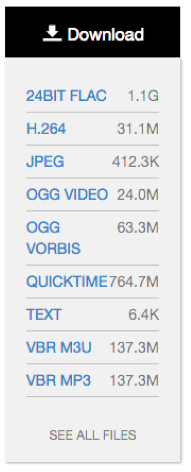
Download menu open by default
We took that input — along with information from user tests, interviews with some of our power users, chats with partners — and tried to identify areas of the interface that seemed to be working well, and other areas that were not.
The evolution of downloading files from items is a great example of the process we’ve been following. The original design for item pages de-emphasized download as a feature. Our conversations with users told us that most people wanted to hit a play button, not download a file.
You could still download in the original design, of course, but you had to click a button to get options and then click again if you wanted specific files.
But when we opened the new site up to more users, we got many comments from people who either disliked the extra clicking, didn’t like leaving the page to get individual files, didn’t understand what the options represented, or couldn’t find the download options at all.
The first thing we tried was just opening up the download menu by default. Instead of just seeing the black download button on the page, you now also saw a menu of options. More people saw the download, but feedback made it clear that users still had issues.
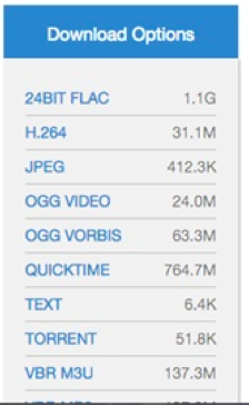
What if we make it blue? (Nope!)
We thought perhaps if we increased the visibility of the download options by turning the Download header blue that people would see it faster. We did an A/B test with 50% of users seeing each option — neither option really won. And the feedback about this feature continued to be negative.
It became clear that we needed to rethink the design of the download options all together, trying to keep it clean-looking and easy to use while also satisfying the concerns of our most advanced users.
We set some goals for the download changes based on the feedback we had received:
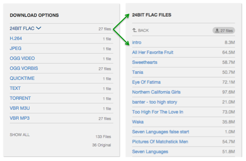
- must be able to download an individual file without leaving the item page
- if there is only one file in a particular format, you should only need one click to download it
- improve the ability to download groups of files (e.g. “just give me all the FLAC files”)
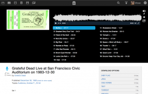
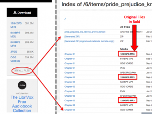
The current version of downloads allows you to consume individual media files without leaving the page and gives you a lot more options for downloading groups of files from an item. Since we released the new Download Options feature, the negative feedback about this feature has dropped off almost entirely. So we think we’re on the right track! We have created a short video tour for the downloads feature if you want to learn more.
The download changes are just one example of how much your feedback has helped us identify areas of confusion on the site and understand how to improve things. Here are a few more examples:
- A-Z filters available when sorting by title or creator
- better experience for people with javascript disabled
- fixes to improve software emulation
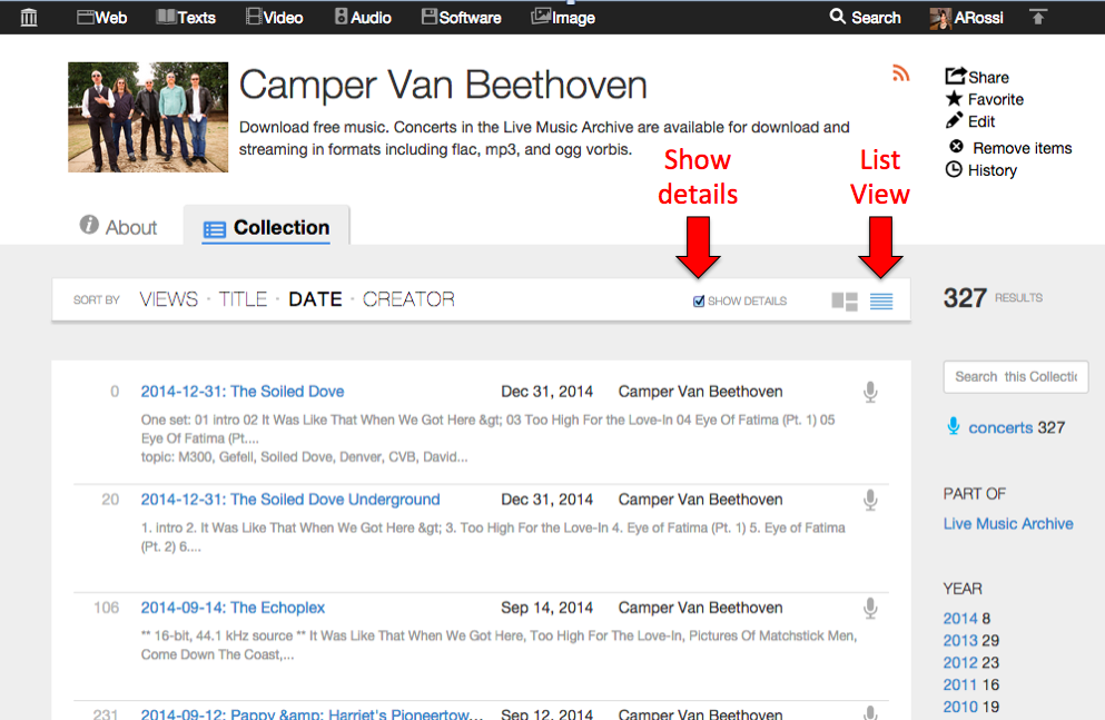
- default search results to List view (instead of image-based Thumbnail view)
- pull user page images from gravatar if available (if user has not uploaded one)
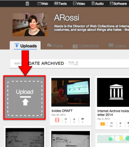
We have a lot more in store for the new site – better accessibility for sight disabled people, tools for creating your own collections, improved playback for multimedia items, etc. As these features trickle into the site, we hope you will continue to share your questions and ideas with us – you are truly helping us to make the archive a better place for everyone.
This project receives support from the John S. and James L. Knight Foundation’s Knight News Challenge.



 ies outside the Archive to save, manage and share their cultural treasures— further democratizing access to all knowledge. Citizen-archivists will be able to build collections, enhance metadata and join like-minded communities in deciding what of our history gets archived and made accessible to everyone, forever, for free.