Author Archives: Kalev Leetaru

A New Approach To Understanding War Through Television News: Introducing The TV News Visual Explorer & The Belarusian, Russian & Ukrainian TV News Archive

For more than 20 years, the Internet Archive’s Television News Archive has monitored television news, preserving more than 9.5 million broadcasts totaling more than 6.6 million hours from across the world, with a continuous archive spanning the past decade. Today just a small sliver of that archive is accessible to journalists and scholars due to the inaccessibility of video at this scale: fast forwarding through that much television news is simply beyond the ability of any human to make sense of. The small fraction of programs that contain closed captioning, speech recognition transcripts or OCR’d onscreen text can be keyword searched through the TV Explorer and TV AI Explorer, but for the majority of this global multi-decade archive, there has until now been no way for researchers to assess and understand the narratives of television news at scale, especially the visual landscape that distinguishes television from other forms of media and which is so central to understanding many of the world’s biggest stories from war to pandemics to the economy.

As the TV News Archive enters its third decade, it is increasingly exploring the ways in which it can preserve the domestic and international response to global events as it did with 9/11 two decades ago. As a first step towards this vision, over the last few months the Archive has preserved more than 46,000 broadcasts from domestic Belarusian, Russian and Ukrainian television news channels, including (in the order they were added to the Archive) Russia Today (part of the Archive since July 2010 but included in this collection starting January 1), Russian channels 1TV, NTV and Russia 1 (from March 26) and Russia 24 (from April 25), Ukrainian channel Espreso (from April 25) and Belarusian channel Belarus 24 (from May 16).

Why preserve television news coverage in a time of war? For journalists today it makes it possible to digest and report on how the war is being framed and narrated, with an eye towards how these narratives influence and shape popular support for the conflict and its potential future trajectory. For future generations of scholars, it makes it possible to look back at the contemporary information environment and prevailing public information, perspectives, and narratives.

While there are myriad options for the general public to watch these channels today in realtime, there is no research-oriented archival interface designed for journalists and scholars to understand their coverage at the scale of days to months, to scan for key visuals and events and to comment, discuss and illustrate how nations are portraying major stories.

To address this critical need, today we are tremendously excited to unveil the Television News Visual Explorer, a collaboration of the GDELT Project, the Internet Archive’s Television News Archive and the Media-Data Research Consortium to explore new approaches to enabling rapid exploration and understanding of the visual landscape of television news.

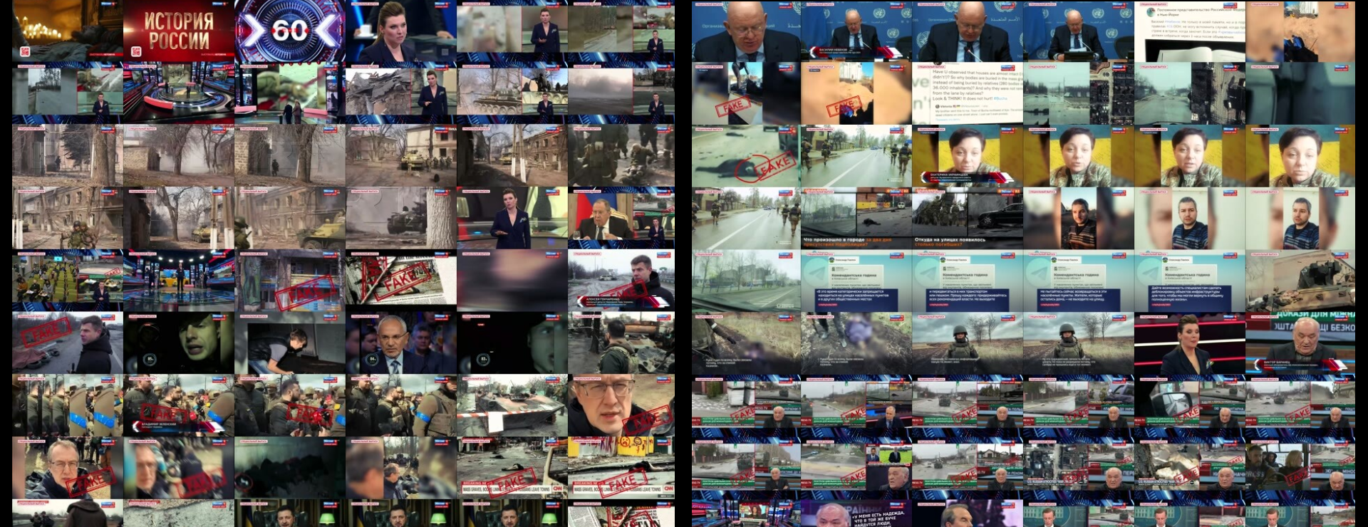
The Visual Explorer converts each broadcast into a grid of thumbnails, one every 4 seconds, displayed in a grid six frames wide and scrolling vertically through the entire program, making it possible to skim an hour-long broadcast in a matter of seconds. Clicking on any thumbnail plays a brief 30 second clip of the broadcast at that point, making it trivial to rapidly triage a broadcast for key moments. The underlying thumbnails can even be downloaded as a ZIP file to enable non-consumptive computational analysis, from OCR to augmented search.

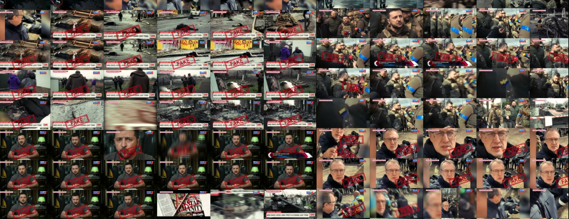
Machines today can catalog the basic objects and activities they see in video and generate transcripts of their spoken and written words, but the ability to contextualize and understand the meaning of all that coverage remains a uniquely human capability. No person could watch the entirety of the Archive’s 6.6 million hours of broadcasts, yet even just the 46,000 broadcasts in this new collection would be difficult for a single researcher to watch or even fast forward through in their entirety. Television’s linear format means coverage has historically been consumed a single moment at a time like a flashlight in a darkened warehouse. In contrast, this new interface makes it possible to see an entire broadcast all at once in a single display, making television news “skimmable” for the first time.

The Visual Explorer and this new research collection of Belarusian, Russian and Ukrainian television news coverage represent early glimpses into a new initiative reimagining how memory institutions like the Archive can make their vast television news archives more accessible to scholars, journalists and informed citizens. Beneath the simple and intuitive interface lies an immensely complex and highly experimental set of workflows prototyping both an entirely new scholarly and journalistic interface to television news and entirely new approaches to rapidly archiving international television coverage of global events.

Over the coming weeks, additional channels from the TV News Archive will become available through the new Visual Explorer, as well as a variety of experiments with the new lenses that tools like automatic transcription and translation can offer in helping journalists and scholars make sense of such vast realtime archives.

Get Started With The Television News Visual Explorer!

About Kalev Leetaru

For more than 25 years, GDELT’s creator, Dr. Kalev H. Leetaru, has been studying the web and building systems to interact with and understand the way it is reshaping our global society. One of Foreign Policy Magazine’s Top 100 Global Thinkers of 2013, his work has been featured in the presses of over 100 nations and fundamentally changed how we think about information at scale and how the “big data” revolution is changing our ability to understand our global collective consciousness.

Who’s Really Winning the Media Wars in the 2016 Campaign?

When it comes to media coverage, it seems as if Donald Trump is “trumping” all his rivals, Republicans and Democrats alike.  But is that true?  And how does it vary by print, digital and television media?  Using the Internet Archive’s Television Archive and the GDELT Project, researcher Kalev Leetaru is able to analyze daily data to see who is winning the media wars of 2016.  Today we are excited to announce three new visualizations that explore American politics through the lens of television: a live campaign tracker hosted by The Atlantic that offers a running tally of all mentions of the 2016 presidential candidates across national television monitored by the Archive, and two visualizations that show which statements from the first Republican debate went viral on television.  Finally, an analysis published in The Guardian shows just how unique television coverage of the campaign is and how much it differs from print and online coverage.  Candidates live and die by their ability to capture media attention.  Now, thanks to Leetaru, citizens have the tools to examine the election media data daily.

A Live 2016 Campaign Tracker

atlantic-television-tracker


Media coverage of the 2016 presidential candidates has been dominating the news cycle for the last few months, with article after article asking which candidate is dominating the headlines at the moment.   Working with The Atlantic, we created the visualization above that tallies how many times each candidate has been mentioned on domestic national television networks thus far in 2015.  The list updates each morning, providing an incredibly unique peek into who is pulling ahead at the moment.  For those interested in drilling further into the data, an interactive explorer dashboard allows you to drill down by candidate and network.

Who Won the First Republican Debate?

debate

This past July we used audio fingerprinting technology from the Laboratory for the Recognition and Organization of Speech and Audio at Columbia University to scan the audio of all monitored television shows for two weeks after the President’s January 2015 State of the Union address and identified every time an excerpted clip of his speech was broadcast on another television show.  In this way we were able to create an interactive timeline of which portions of his speech went “viral”.

We’ve repeated that process for the first Republican debate, both the “prime” and “undercard” events, exploring which soundbites made the rounds across television news shows in the week following the debate.

For the undercard debate, Carly Fiorina was the clear winner, account for 45% of the soundbites from the debate that subsequently aired elsewhere in the following week, followed by Rick Perry at 15.7%.  Both of the most-excerpted responses from the undercard debate belonged to her, with her quote “Hillary Clinton lies about Benghazi, she lies about emails. She is still defending Planned Parenthood, and she is still her party’s frontrunner” appearing 53 times and her quote “Did any of you get a phone call from Bill Clinton? I didn’t. Maybe it’s because I hadn’t given money to the foundation or donated to his wife’s Senate campaign.” appearing 47 times.

For the prime debate, Trump was the overall winner, with 30.7% of the subsequently aired soundbites being his, followed by Rand Paul at 14.1% and Chris Christie at 13.7%.  The two most-excerpted statements of the debate were both by Trump, one regarding his refusal to pledge not to run as an Independent, which aired 199 times, and the second about his past misogynic Twitter comments, which aired 337 times.  Rand Paul and Chris Christie’s exchange about the fourth amendment and government surveillance aired 190 times, culminating in Rand Paul’s now-famous “I know you gave [President Obama] a big hug, and if you want to give him a big hug again, go right ahead.”  Ben Carson’s closing remarks about his work as a surgeon were the most-repeated of any of the candidates, with 86 rebroadcasts over the following week.

How Much Coverage is Trump Really Getting?

guardian-trump-analysis

Finally, with all of the hyperbole swirling about Trump’s utter domination of media coverage of the Republican race, a key question is just how much his lead differs across media modalities.  Is online news coverage of 2016 campaign cycle identical to print coverage identical to television coverage?  In a piece for The Guardian’s Data Blog, I explored election coverage across these different forms of media and found that Trump’s lead is entirely dependent on where you look, emphasizing just how important it is to be able to analyze television coverage directly.

As the 2016 political season begins to shift into high gear stay tuned for so much more to come as we explore television and politics!

Tracking Politics on Television: Campaign Advertising and the State of the Union Going Viral

Today the GDELT Project and the Internet Archive debut two exciting new interactive visualizations of the TV News Archive, one tracing the flow of money through campaign advertising in Philadelphia in the 2014 election cycle, and the other introducing a whole new way of tracing what “goes viral” on television by charting how the President’s 2015 State of the Union address was excerpted and discussed across American and select international television over the following two weeks.

Media & Money: Political Advertising in Philly’s 2014 Races

phillytvadanalysis

As part of the Philly Political Media Watch Project, from September 1, 2014 through the election of November 4, 2014, 7 television stations in the Philadelphia market were monitored to identify all politically-related advertisements.  In all, 74 distinct political advertisements were identified which collectively aired 13,675 times during the 65 day monitoring period, with Archive staff scoring them for the time each devoted to supporting, attacking, and defending a candidate.  A combination of human review and computerized analysis was used to identify every broadcast of each of the 74 ads over the 65 days, along with the sponsor paying for that particular airing.  The end result is an interactive visualization that allows you to explore the television advertising landscape of Philadelphia last fall, comparing any pair of candidates, parties, races, status, win/lost, sponsor, sponsor type, television channel, or even keywords found in the transcripts, or any combination therein.  The ability to exhaustively identify every single airing of a political advertisement during the key campaigning period and determine who paid for each broadcast offers an incredible new tool for understanding the impact of media and money in the political campaigning process.

For example, you can compare ads focusing on Tom Corbett that were paid by Tom Corbett for Governor vs those paid for by Tom Wolf for Governor. Or, compare all ads mentioning the two candidates from any sponsor.  Or ads focusing on candidates that ultimately won vs lost. Or, compare the ads run by the Philadelphia Federation of Teachers vs those run by the House Majority PAC. Or, those mentioning “school” vs “job” in the transcript of the ad. Or, simply, view the overall trends for all 13,675 advertisement airings.

A New Approach to Measuring Virality on Television: State of the Union 2015

sotutvanalysis

Turning from local to national television, the second visualization explores how American and select international television excerpted and discussed the President’s January 20, 2015 State of the Union (SOTU) speech.  The social media era has profoundly altered the political communications landscape, ushering in a fixation on tracking emerging political “memes” and which pieces of political discourse are “going viral” at the moment.  Yet, we lack metrics for measuring what “goes viral” on television – a critical gap considering that television is still a dominate source of political news for 37% to 60% of Americans.  Thus, the “State of the Union 2015: Tracking ‘Going Viral’ on Television” project was born to prototype a brand-new way of tracking “memes” on television – the ability to take a speech or other television show, select a short clip of it, and instantly see every instance of that clip that was aired anywhere across the landscape of the world’s television monitored by the Archive.

Using the audfprint tool developed by Dan Ellis at the Laboratory for the Recognition and Organization of Speech and Audio at Columbia University, the 2015 State of the Union speech was broken into sentence-long soundbites, with each soundbite scanned against all news television shows archived by the Internet Archive from the evening of the January 20, 2015 speech through February 4, 2015 (two weeks later). The non-commercial audfprint tool scans the audio track of each show, so it is not dependent on closed captioning, which is extremely noisy and entirely absent from many foreign language broadcasts.  The tool is also extremely sensitive, able to detect brief excerpts even when they are overdubbed by a commentator and/or other sound effects. In total, 13,082 news shows totaling 649 hours of programming were scanned, and excluding “gavel-to-gavel” coverage (broadcasting the entire speech from start to finish), 208 distinct shows played an excerpt from the speech over 524 broadcasts.  An interactive visualization allows you to scroll through the speech passage by passage to see how each was excerpted and discussed and you can even watch short preview clips of each mention.

What you are seeing here is a first glimpse of a whole new way of exploring television, using enormously powerful computer algorithms as a new lens through which to explore the Internet Archive’s massive archive of television news.