Tag Archives: television news

Get your Dem debate visualizations here

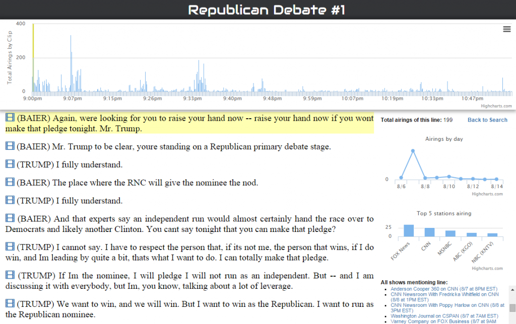
Hot off the internet presses, here is media analyst’s Kalev Leetaru’s visualization tool, fueled by Internet Archive data, which enables users to trace particular phrases used in broadcast news coverage in the first 24 hours after would-be presidential nominees appeared in the first Democratic debate of the 2016 election.

Scroll down and what sticks out immediately are the two subjects that captured most of the news broadcasters’ attention: “Bernie Sanders’ “damn emails” quote and guns.

When the subject came up of the controversy over Clinton’s decision to do public work from a private email server, rather than attack Clinton, Sanders defended her:

“Let me say — let me say something that may not be great politics. But I think the secretary is right, and that is that the American people are sick and tired of hearing about your damn e-mails.”

According to Internet Archive data, that sound bite aired 496 times across stations.

The other issue that grabbed attention was gun violence: Sanders, who hails from gun-friendly rural Vermont, was called to task for his vote to make it tougher to hold gun manufacturers liable when the guns they make are used in a crime. Answering a question by CNN moderator Anderson Cooper, on whether Sanders is tough enough on guns, Clinton said:

“No, not at all. I think that we have to look at the fact that we lose 90 people a day from gun violence. This has gone on too long and it’s time the entire country stood up against the NRA. The majority of our country…(APPLAUSE)… supports background checks, and even the majority of gun owners do.”

This clip aired 260 times across stations.

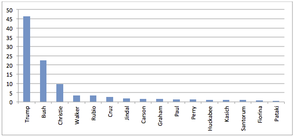
However, these are just the top take-aways from this massive data crunching tool. It provides a search mechanism for the user to do deeper dives into the data and discover trends across and within certain types of news broadcasts.

Leetaru’s own analysis is here, on the Washington Post’s Monkey Cage. Among his observations:

There was also variation in how much attention each network paid to each candidate (you can see for yourself using the interactive visualization). Telemundo favored Sanders with 41 percent, followed by O’Malley with 24 percent and Clinton at just 21 percent, though admittedly, they broadcast a relatively small number of excerpts. FOX Business also favored Sanders 50 percent to Clinton’s 38 percent, as did CSPAN with Sanders at 52 percent to Clinton’s 44 percent. All other networks favored Clinton, though sometimes by a relatively close margin — like CNBC (50 percent Clinton to 43 percent Sanders) or PBS affiliates (41 percent Clinton to 38 percent Sanders).

This tool is also part of the Internet Archive’s testing of technology that we’ll use in our new Knight Foundation funded project to track political TV ads in key primary states, which will launch in early December.

Dig in and have fun.

As Democratic candidates debate, Internet Archive will be gathering data

When Hillary Clinton and Bernie Sanders take the podium tonight along with other contenders for the Democratic presidential nomination in 2016, their debate will be televised. The Television Archive will be tracking the news coverage surrounding the debate, viewable and searchable, here.

And this tool, developed by political scientist Kalev Leetaru  and fueled by Internet Archive data, allows users to see how many times a particular candidate’s name is mentioned in news coverage. Going into the debate, Hillary Clinton is getting more than twice as mentions as Sen. Bernie Sanders.

We take for granted that candidates will debate on screen, but it wasn’t always so. The faceoff between Republican Vice President Richard Nixon and Democrat U.S. Senator Jack Kennedy in 1960, 55 years ago last month, marked the first time that Americans were able to watch candidates for the nation’s highest office from the comfort of their living rooms. You can see part one of the debate here, preserved on the Archive’s servers:

The received wisdom about this famous debate was that, from this point on, candidates had to think not just about what they said on the campaign stump, but how they looked. This could make a huge difference in how the public and the media perceived who “won” the debate. Nixon looked tired and like he needed a shave. Kennedy looked healthy and vibrant. Those who listened on the radio thought Nixon won.

“It’s one of those unusual points in the timeline of history where you say things changed very dramatically–in this case, in a single night,” Alan Schroeder, a media historian and associate professor at Northeastern University, told Time Magazine in 2010.

Here’s part II of the Kennedy-Nixon 1960 debate:

We don’t know yet who the perceived winner of tonight’s debate will be. The Internet Archive’s data will provide one way to evaluate this. Stay tuned.

Who’s Really Winning the Media Wars in the 2016 Campaign?

When it comes to media coverage, it seems as if Donald Trump is “trumping” all his rivals, Republicans and Democrats alike.  But is that true?  And how does it vary by print, digital and television media?  Using the Internet Archive’s Television Archive and the GDELT Project, researcher Kalev Leetaru is able to analyze daily data to see who is winning the media wars of 2016.  Today we are excited to announce three new visualizations that explore American politics through the lens of television: a live campaign tracker hosted by The Atlantic that offers a running tally of all mentions of the 2016 presidential candidates across national television monitored by the Archive, and two visualizations that show which statements from the first Republican debate went viral on television.  Finally, an analysis published in The Guardian shows just how unique television coverage of the campaign is and how much it differs from print and online coverage.  Candidates live and die by their ability to capture media attention.  Now, thanks to Leetaru, citizens have the tools to examine the election media data daily.

A Live 2016 Campaign Tracker

atlantic-television-tracker


Media coverage of the 2016 presidential candidates has been dominating the news cycle for the last few months, with article after article asking which candidate is dominating the headlines at the moment.   Working with The Atlantic, we created the visualization above that tallies how many times each candidate has been mentioned on domestic national television networks thus far in 2015.  The list updates each morning, providing an incredibly unique peek into who is pulling ahead at the moment.  For those interested in drilling further into the data, an interactive explorer dashboard allows you to drill down by candidate and network.

Who Won the First Republican Debate?

debate

This past July we used audio fingerprinting technology from the Laboratory for the Recognition and Organization of Speech and Audio at Columbia University to scan the audio of all monitored television shows for two weeks after the President’s January 2015 State of the Union address and identified every time an excerpted clip of his speech was broadcast on another television show.  In this way we were able to create an interactive timeline of which portions of his speech went “viral”.

We’ve repeated that process for the first Republican debate, both the “prime” and “undercard” events, exploring which soundbites made the rounds across television news shows in the week following the debate.

For the undercard debate, Carly Fiorina was the clear winner, account for 45% of the soundbites from the debate that subsequently aired elsewhere in the following week, followed by Rick Perry at 15.7%.  Both of the most-excerpted responses from the undercard debate belonged to her, with her quote “Hillary Clinton lies about Benghazi, she lies about emails. She is still defending Planned Parenthood, and she is still her party’s frontrunner” appearing 53 times and her quote “Did any of you get a phone call from Bill Clinton? I didn’t. Maybe it’s because I hadn’t given money to the foundation or donated to his wife’s Senate campaign.” appearing 47 times.

For the prime debate, Trump was the overall winner, with 30.7% of the subsequently aired soundbites being his, followed by Rand Paul at 14.1% and Chris Christie at 13.7%.  The two most-excerpted statements of the debate were both by Trump, one regarding his refusal to pledge not to run as an Independent, which aired 199 times, and the second about his past misogynic Twitter comments, which aired 337 times.  Rand Paul and Chris Christie’s exchange about the fourth amendment and government surveillance aired 190 times, culminating in Rand Paul’s now-famous “I know you gave [President Obama] a big hug, and if you want to give him a big hug again, go right ahead.”  Ben Carson’s closing remarks about his work as a surgeon were the most-repeated of any of the candidates, with 86 rebroadcasts over the following week.

How Much Coverage is Trump Really Getting?

guardian-trump-analysis

Finally, with all of the hyperbole swirling about Trump’s utter domination of media coverage of the Republican race, a key question is just how much his lead differs across media modalities.  Is online news coverage of 2016 campaign cycle identical to print coverage identical to television coverage?  In a piece for The Guardian’s Data Blog, I explored election coverage across these different forms of media and found that Trump’s lead is entirely dependent on where you look, emphasizing just how important it is to be able to analyze television coverage directly.

As the 2016 political season begins to shift into high gear stay tuned for so much more to come as we explore television and politics!

Mapping 400,000 Hours of U.S. TV News

TVnewMap2
We are excited to unveil a couple experimental data-driven visualizations that literally map 400,000 hours of U.S. television news. One of our collaborating scholars, Kalev Leetaru, applied “fulltext geocoding” software to our entire television news research service collection. These algorithms scan the closed captioning of each broadcast looking for any mention of a location anywhere in the world, disambiguate them using the surrounding discussion (Springfield, Illinois vs Springfield, Massachusetts), and ultimately map each location. The resulting CartoDB visualizations provide what we believe is one of the first large-scale glimpses of the geography of American television news, beginning to reveal which areas receive outsized attention and which are neglected.

Watch4-year


Watch TV news mentions of places throughout the world for each day.


Compare-Contrast


Select a TV station and time window to view their representations of places.


Keep in mind that as you explore, zoom-in and click the locations in these pilot maps, you are going to find a lot of errors. Those range from errors in the underlying closed captioning (“two Paris of shoes”) to locations that are paired with onscreen information (a mention of “Springfield” while displaying a map of Massachusetts on the screen). Thus, as you click around, you’re going to find that some locations work great, while others have a lot more error, especially small towns with common names.

What you see here represents our very first experiment with revealing the geography of television news and required bringing together a bunch of cutting-edge technologies that are still very much active areas of research. While there is still lots of work to be done, we think this represents a tremendously exciting prototype for new ways of interacting with the world’s information by organizing it geographically and putting it on a map where it belongs!

Virtual Machines: Unlocking Media for Research

In addition to our public web-based research service, we are facilitating scholars, like Kalev, and other researchers in applying advanced data treatments to our entire collection, at a speed and scale beyond any individual’s capacity. As responsible custodians of an enormous collection of television news content created by others, we endeavor to secure their work within the context of our library. Therefore, rather than lending out copies of large portions of the collection for study, researchers instead work in our “virtual reading room” where they may run their computer algorithms on our servers within the physical confines of the Archive. We hope our evolving demonstrations of this data queries in — results out — process may help forge a new model for how exceptional public interest value can be derived from media without challenging their value and integrity to their creators.

The Knight Foundation and other insightful donors are providing critical support in our ongoing efforts to open television news and join with others in re-visioning how digital libraries can respectfully address the educational potential of other diverse media. We hope you will consider lending your support.

The Atlantic

UCLA Brings Light to the Undiscovered Country of Television News

The UCLA Library recently launched a remarkable broadcast news  research and education platform, Broadcast NewsScape.   The service is accessible online to users on the UCLA campus.  Platform managers hope to expand access throughout the UC system later this year.  NewsScape captures closed captioning, in a manner similar to our TV News Search & Borrow, to facilitate deep search and discovery of relevant segments of over 200,000 U.S. and international news program episodes.

BroadcastNewsScape1We are excited that the UCLA library has joined Vanderbilt University and the Internet Archive in offering tailored research and public interest access to television news.  These successful demonstrations of responsibly providing public benefit access to television news are helping to enrich conversations regarding mutual benefits among media and library stakeholders.

UCLA has a storied history in archiving television news, starting with the 1974 Senate Watergate hearings.  Between 1979 and 2003, UCLA recorded off-air more than 100,000 news programs, preserving and making them accessible in UCLA’s Film & Television Archive’s News and Public Affairs Collection  In 2005, Communication Studies department professors Francis F. Steen and Tim Groeling brought UCLA’s television news archiving into the digital age, recording direct to disks and, most transformationally, preserving available closed captioning.  Their collection has enabled researches to experiment with new digital processes for analyzing attributes of broadcast news.

NewsScape_infrastructureLast year, the UCLA Library started making provisions to take the digital news archive under its wing, devoting considerable server resources and relieving Francis and Tim from their 8-year labor of love maintaining their modest, sometimes cantankerous, hardware and ever-growing data stores.

Thanks to the leadership of associate university librarians Todd Grappone and Sharon Farb, the UCLA Library’s newly launched Broadcast NewsScape tool is welcoming scholars, educators and students from throughout the university to delve deeply and and derive new insights from the undiscovered country that is television news.

UCLA’s announcement: http://newsroom.ucla.edu/portal/ucla/ucla-library-launches-transformative-243873.aspx